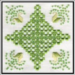
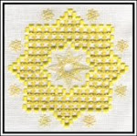
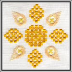
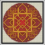
As some of you know I've been trying to get a new logo for a while. When I started the business I used the teddy as a logo because he was the first design that I finished for sale. Whilst he is perfect for my nursery based designs I don't feel that he fits all the designs that I'm producing. I've been looking for something that says something about me, without it clashing with any of my work. For this reason I've been playing with a spotlight theme as it's a way of combining my old life in the theatre to illuminate the new (if that makes any sense) I asked a friend's husband who is a graphic designer to work on something and he came up with these.

 They need colour and my friend is a busy person so I've been having a few tries myself.

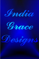


 I'm just not sure how I feel about them though so I guess I'm asking for a bit of feedback on them, even if it's 'scrap them and start again from scratch.' Thanks in advance.










5 comments:
I think that the font you have used on your website with your Teddy Bear should be kept and if it was me I would go for a logo with just the 'I-G-D' perhaps like a monogram' just my thoughts
Terry
Thanks - I did want to keep that font for continuity. I experimented with others as it's such a fine font it doesn't show up well - it looks good though (when it can be seen)
I don't know if I'm well known enough to go by initials - when people talk about HAED etc most people know what you're on about. I'd love to get to that stage!! It's worth a thought/try.
Thanks very much.
Personally I prefer the last one - seems to be the one where your company name 'leaps out' at you. Just a thought - why not get your little one to 'draw' something with her name (as it's your company name, lol!) and see if you could use that. Viv xx
Yes - I think I need the sharper contrast in colours that I've got on the last one.
I'm sure India would be happy to draw me a logo - would certainly be original!!
I really like the first one Vicki - very classy.
Post a Comment